Industry
Education / Branding
Client
London South Bank University
Rebranding three student halls into one cohesive identity at LSBU.

Unifying three disjointed hall brands into one cohesive, inclusive identity.
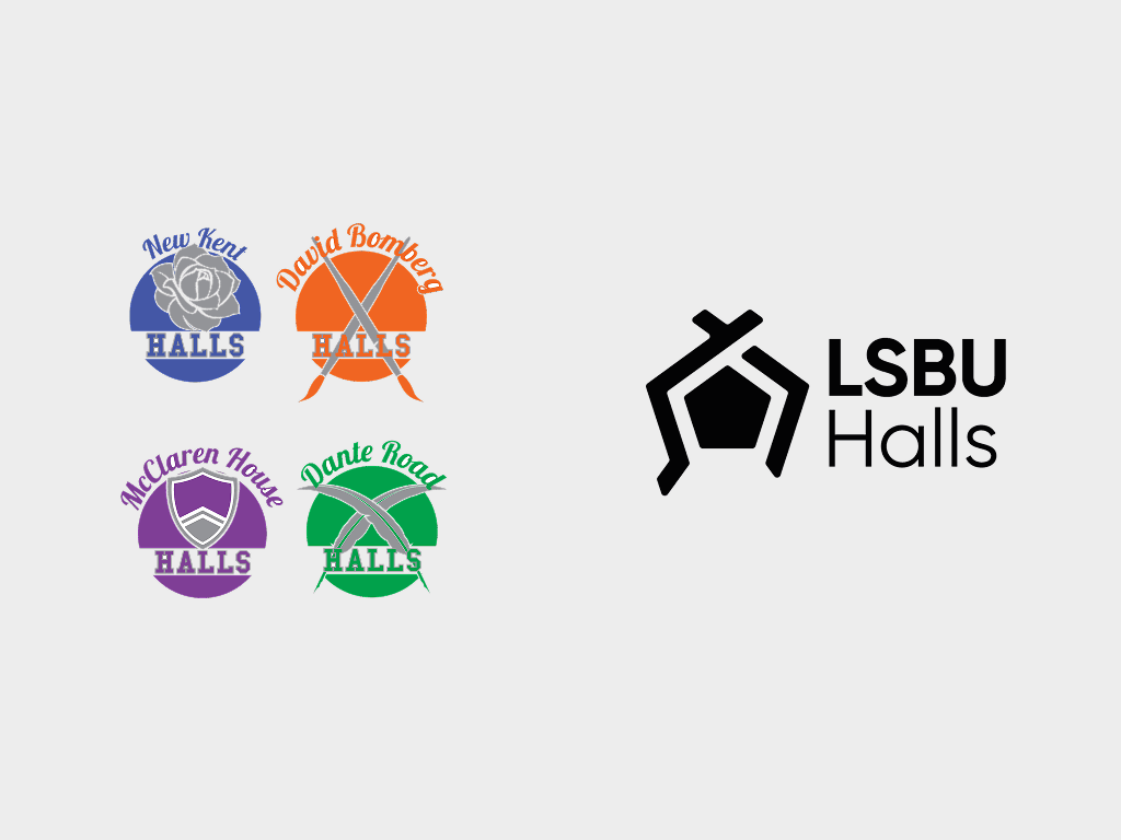
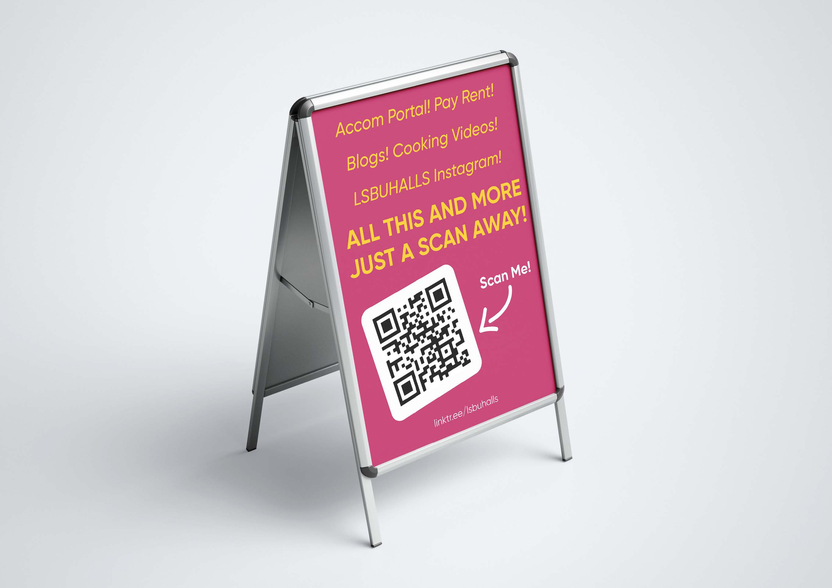
I led a full rebrand of the Halls of Residence at London South Bank University, bringing three disjointed brands with clashing colour schemes into a single, cohesive identity. The brief was to create something that felt equal across all locations, helping students feel part of a shared community without losing what made each hall distinct. I developed a digital-first visual language that worked across social media, event materials, video content, and on-site wayfinding. To make it last beyond the project, I produced a full brand toolkit with guidelines, templates, and real-world examples, so internal teams could keep it consistent without needing a designer every time.


One brand, three halls, and students who finally felt part of something shared.
The rebrand landed well. The accommodation and marketing teams told us it made communication with students noticeably more coherent, and the simplified system meant they could produce new materials quickly without constantly going back to a designer. More than that, it gave the halls a sense of shared identity. Students across different buildings felt part of the same community, which was always the point. It was an early project, but one I'm still proud of. Good brand work should make things easier for the people using it, and this one did.


Industry
Education / Branding
Client
London South Bank University
Rebranding three student halls into one cohesive identity at LSBU.
Unifying three disjointed hall brands into one cohesive, inclusive identity.
I led a full rebrand of the Halls of Residence at London South Bank University, bringing three disjointed brands with clashing colour schemes into a single, cohesive identity. The brief was to create something that felt equal across all locations, helping students feel part of a shared community without losing what made each hall distinct. I developed a digital-first visual language that worked across social media, event materials, video content, and on-site wayfinding. To make it last beyond the project, I produced a full brand toolkit with guidelines, templates, and real-world examples, so internal teams could keep it consistent without needing a designer every time.
One brand, three halls, and students who finally felt part of something shared.
The rebrand landed well. The accommodation and marketing teams told us it made communication with students noticeably more coherent, and the simplified system meant they could produce new materials quickly without constantly going back to a designer. More than that, it gave the halls a sense of shared identity. Students across different buildings felt part of the same community, which was always the point. It was an early project, but one I'm still proud of. Good brand work should make things easier for the people using it, and this one did.
Industry
Education / Branding
Client
London South Bank University
Rebranding three student halls into one cohesive identity at LSBU.
Unifying three disjointed hall brands into one cohesive, inclusive identity.
I led a full rebrand of the Halls of Residence at London South Bank University, bringing three disjointed brands with clashing colour schemes into a single, cohesive identity. The brief was to create something that felt equal across all locations, helping students feel part of a shared community without losing what made each hall distinct. I developed a digital-first visual language that worked across social media, event materials, video content, and on-site wayfinding. To make it last beyond the project, I produced a full brand toolkit with guidelines, templates, and real-world examples, so internal teams could keep it consistent without needing a designer every time.